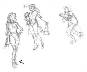
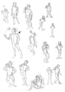
Recently, I put together some Archie character drawings to try out for a penciling position.
Working with pre-existing characters is different than designing your own. I first had to familiarize myself with nuances of the "house style" to draw the characters on-model. I did this by sketching the characters, while carefully studing the spacing and proportions of their features, especially their faces.
Finding the Pose
Once I felt comfortable drawing the characters, I did some thumbnail sketches for each character's pose, searching for the best character-appropriate gesture for each. It's worth noting that when I'm doing gesture sketches like this, I'm working small and fast. I'm not worried about proportions or details--that comes later. This is all about finding the pose.
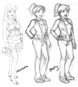
Veronica
Veronica is the rich girl that pretty much gets what she wants. I decided to give her a hand-on-the-hip pose that emphasized her confidence and stylishness. For her outfit, a cute flirty dress, clutch handbag, and a bit of bling. I briefly entertained the idea of a more illustrative shopping scene for her (with bag carrying Archie in tow), but decided to stick with standalone poses.
Betty
To contrast Veronica, I went with a sportier pose, and jeans and jacket outfit for Betty. I got pretty far in the drawing when I realized the pose was a bit too similar (hand-on-hip again) to Veronica's.
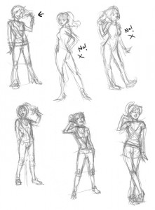
Keeping the keywords "cute" and "sporty" in mind, I started over. Of these, the first two I did (upper middle, upper right) weren't right at all for Betty -- too sexy; too cutesy. After that, I stopped and reconsidered the character. Sweet and sporty. I liked the gesture of Betty twirling a finger around her hair to showcase her ponytail, so I kept that in the rest of the sketches. I ended up going with my third attempt (first sketch on the top left).
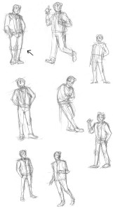
Archie
Archie's your average, nice guy character that everyone gets along with. For his pose I decided to show him "just hanging out".
Jughead
Jughead's the goofy comic relief character. To capture his cartoony mannerisms, I tried to push his poses towards the extreme (without going too far). I thought it would be funny to show him tossing an entire burger in his mouth the way you might with a piece of candy.
Polishing the Art
Once I had my poses selected for each character, I printed out the sketches at a larger size with blue lines so I could do a clean pencil pass over them with their proper details and proportions.
And here's the finished results!
Showing posts with label tips. Show all posts
Showing posts with label tips. Show all posts
Thursday, November 18, 2010
Friday, February 5, 2010
Creative Lettering in Comics
There has recently been a lot of scrutiny over the quality of lettering in the Twilight manga adaption. From what I've seen, I don't disagree. The lettering is lackluster, difficult to read and feels like an afterthought-- word balloons seem to be transparent and awkwardly placed for no other reason than simply because there wasn't any space allotted for them when the artist made the page. For example, the second panel of this sample page shows two hands touching over a microscope, but a word balloon has been plopped over top of it, covering the primary focus of the panel with dialogue.
I've read a number of blog posts listing lettering mistakes in the Twilight manga . But while there are basic guidelines for readability, lettering is not an exact science. As with other art forms, the art of lettering is subjective. Some of the techniques that have been identified by some bloggers as "wrong", such as word balloons bridging multiple panels, transparent word balloons, and overlapping word balloons, can actually be used to good effect under the right circumstances.
Here are some examples from various manga to show you what I mean:
Word balloons bridging between two panels - This can be an effective and interesting way to transition between scenes, or tie two panels together for a greater emphasis of their connection to each other.
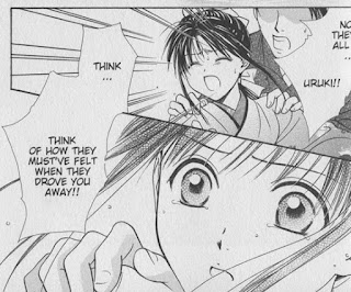
In this scene from Fushigi Yugi Genbu Kaiden by Watase Yuu, we see Takiko's change in reaction over two panels as another character gives her insight into the reasons behind an earlier event. The bridging word balloon makes the transition feel smoother and her reaction immediate, as the other character is speaking. Breaking up the dialogue into two separate balloons would have changed the timing of her reaction.
In the Suikoden III manga , Aki Shimizu raises the tension of an opposing army charging forward by connecting Lucia's word balloon to the adjacent panels. This gives us a sense that the enemy's war cry is ongoing (*and* getting louder - note the increasing size of the "aaaAAA" sound effect) as she instructs her son, Hugo, to make a critical choice.
Transparent word balloons - Used sparingly with thoughtful application, transparent word balloons can allow text to greater integrate with the imagery contained within the panel.
In these examples from Fate/stay Night , the transparent word balloons have a piercing effect, as if the words are going straight through the character as they are told something confusing, shocking, or unexpected.
Naoko Takeuchi uses transparent word balloons often in her Sailor Moon manga. I suspect that the effect is used more for aesthetic reasons, to integrate the balloons with the artwork in an attractive, non-intrusive way, like in this page featuring a full body illustration of Usagi. But it has the added effect of giving us a sense of being within Usagi's psyche as she reacts to information about a legend (the balloons contain voiceover dialogue from Rei).
In all of these examples, there's plenty of room where balloons could have been placed without obscuring the artwork, so I think it's safe to assume that they are intentionally transparent for effect.
Overlapping word balloons - Effective for indicating that a character is responding quickly, talking over, or interrupting another character.
Here's two examples from Nana by Ai Yazawa, one of my favorite mangaka. Showing the nuances of character interaction is one of her specialties.
In this panel, Yazawa uses the proximity of the word balloons to contrast between Nana's explosive outburst and Takumi's quick but cool-headed reaction.
In this panel, Junko's boyfriend Kyosuke adds detail to Junko's comment. The overlapping panels here give the impression that these romantically-involved characters are working together to build upon each other's thoughts.
Finally, here's an example from my own book, Peach Fuzz (volume 3, pg 56). This page utilizes all three techniques:
Edwin and Peach are ferrets that don't see eye-to-eye in their needs, so while Peach is concerned with status and entitlement, Edwin is quick to get distracted by the presence of food. As Peach explains the layout of her kingdom in the first panel, Edwin perks up at the mention of food and interrupts her with an overlapping word balloon. His word balloon flows uninterrupted into the second panel, as we close in on Edwin's drooling face. Peach's response bridges the gap between the second and third panels as she explosively wrestles control of the conversation again. Finally, in the fourth panel, Peach's assumptions that Edwin has a kingdom of his own blend seamlessly into the sparkly background through the use of a transparent word balloon, showing us that she's caught up in her own fantasy.
In all of these cases, the style of the word balloons helps express the tone and intent of the character without ever sacrificing readability -- that's important. These techniques should not be used on every page, only when there is a need for it. To use word balloons effectively, I find that it's essential to plan out the word balloons at the same time I'm composing the actions and layout of a page - during the roughing stage.
There's a *lot* more you can do with word balloons and lettering to enhance the story. I'll cover more of the basics and other creative techniques in a future post.
I've read a number of blog posts listing lettering mistakes in the Twilight manga
Here are some examples from various manga to show you what I mean:
Word balloons bridging between two panels - This can be an effective and interesting way to transition between scenes, or tie two panels together for a greater emphasis of their connection to each other.
In this scene from Fushigi Yugi Genbu Kaiden
In the Suikoden III manga
Transparent word balloons - Used sparingly with thoughtful application, transparent word balloons can allow text to greater integrate with the imagery contained within the panel.
In these examples from Fate/stay Night
Naoko Takeuchi uses transparent word balloons often in her Sailor Moon
In all of these examples, there's plenty of room where balloons could have been placed without obscuring the artwork, so I think it's safe to assume that they are intentionally transparent for effect.
Overlapping word balloons - Effective for indicating that a character is responding quickly, talking over, or interrupting another character.
Here's two examples from Nana
In this panel, Yazawa uses the proximity of the word balloons to contrast between Nana's explosive outburst and Takumi's quick but cool-headed reaction.
In this panel, Junko's boyfriend Kyosuke adds detail to Junko's comment. The overlapping panels here give the impression that these romantically-involved characters are working together to build upon each other's thoughts.
Finally, here's an example from my own book, Peach Fuzz
Edwin and Peach are ferrets that don't see eye-to-eye in their needs, so while Peach is concerned with status and entitlement, Edwin is quick to get distracted by the presence of food. As Peach explains the layout of her kingdom in the first panel, Edwin perks up at the mention of food and interrupts her with an overlapping word balloon. His word balloon flows uninterrupted into the second panel, as we close in on Edwin's drooling face. Peach's response bridges the gap between the second and third panels as she explosively wrestles control of the conversation again. Finally, in the fourth panel, Peach's assumptions that Edwin has a kingdom of his own blend seamlessly into the sparkly background through the use of a transparent word balloon, showing us that she's caught up in her own fantasy.
In all of these cases, the style of the word balloons helps express the tone and intent of the character without ever sacrificing readability -- that's important. These techniques should not be used on every page, only when there is a need for it. To use word balloons effectively, I find that it's essential to plan out the word balloons at the same time I'm composing the actions and layout of a page - during the roughing stage.
There's a *lot* more you can do with word balloons and lettering to enhance the story. I'll cover more of the basics and other creative techniques in a future post.
Topic Tags:
art,
comics,
instructional,
lettering,
sequential art,
tips,
tutorial,
word balloons
Tuesday, February 2, 2010
Breaking into Comics
One of the questions I'm frequently asked is how to go about "breaking into" the comic industry. It's a tricky question to answer, because there is no direct path. The comics industry is a tough business to break into. There's a lot of competition. And even once you're "in", every new assignment or project still requires effort to get (though publishing credits do help!).
The most important thing you'll need are strong, stand-out sample comic pages that demonstrate your skills in sequential art. The ability to draw characters consistently on-model and capable of expressing a gamut of emotions, backgrounds in perspective, clarity in sequential storytelling, dynamic action, clear but exciting panel layouts, and so on. The best way to get that is to keep working at it. The more you draw, the better you'll get. Challenge yourself to draw outside of your comfort zone. Draw everything, not just people. The ability to draw human characters is, of course, essential, but comic artists should ALSO be able to draw whatever the script calls for: backgrounds from busy cityscapes to dense forests, cute puppies to ferocious beasts, racing cars to horse-drawn wagons.
Depending on the publisher, the way to get your work seen is to take it to a convention where an editor is doing portfolio reviews. They can give you the feedback you need to further improve your pages, or if your work is good enough, hire you on the spot.
The way I got my start with Tokyopop was through their 2nd Rising Stars of Manga competition. (I'm not sure if they're still doing the Rising Stars of Manga, but nowadays there are also other competitions running such as Kodansha’s Morning Magazine International Comic Contest, in which Jared's and my entry, Last Dance, placed as a finalist, and DC's Zuda Comics, which I have not personally entered).
For RSOM, I followed the guidelines, and sent off a short self-contained 20-page comic that landed me grand prize. The editors loved it so much that they asked me to put together a full three-volume version of the series. You know how that turned out. The series was Peach Fuzz. :) From there, I had the credentials and work behind me to get a job as a penciler over at Archie Comics.
If you're interested in writing and drawing stories, the steps are similar but somewhat different. You'll need to put together a comic pitch based on your desired publisher's guidelines. Every publisher is different about what they want. It helps to be aware of which publishers are looking for submissions, and what they want, so that you can tailor your submission to their needs. Check publisher websites for guidelines. But in general, it amounts to about 10-15 sample comic pages, a short (2-3 page) synopsis of how the story would play from start to finish, character designs and bios, and a persuasive query letter. I'm working on putting together one of those packages right now for the new graphic novel story I've developed. :)
Topic Tags:
art,
comics,
how-to,
improvement,
instructional,
tips
Monday, June 29, 2009
Speed Painting - Charly the Shih Tzu

I was thinking about how it's a good idea for artists to practice painting techniques by doing speed paintings from photos or life.
When I'm painting illustrations, I'll sometimes have photos to help with the general feel, but I rarely have direct reference, so shadows and highlights come from my preexisting knowledge. This is certainly limiting my artistic growth, so I'm going to take my own advice and start doing some small practice paintings to improve my speed and technique.
Tonight, I intended to practice foliage but I came across this cute photo I'd taken of Charly, Natalia's adorable Shih Tzu, and decided to paint him instead. :)
Photoshop CS3, 45 minutes.
Watch me create the piece on youtube:
Subscribe to:
Posts (Atom)


