There has recently been a lot of scrutiny over the quality of lettering in the Twilight manga adaption. From what I've seen, I don't disagree. The lettering is lackluster, difficult to read and feels like an afterthought-- word balloons seem to be transparent and awkwardly placed for no other reason than simply because there wasn't any space allotted for them when the artist made the page. For example, the second panel of
this sample page shows two hands touching over a microscope, but a word balloon has been plopped over top of it, covering the primary focus of the panel with dialogue.
I've read a number of blog posts listing lettering mistakes in the
Twilight manga
. But while there are basic guidelines for readability, lettering is not an exact science. As with other art forms, the art of lettering is subjective. Some of the techniques that have been identified by some bloggers as "wrong", such as word balloons bridging multiple panels, transparent word balloons, and overlapping word balloons, can actually be used to good effect under the right circumstances.
Here are some examples from various manga to show you what I mean:
Word balloons bridging between two panels - This can be an effective and interesting way to transition between scenes, or tie two panels together for a greater emphasis of their connection to each other.
In this scene from
Fushigi Yugi Genbu Kaiden
by Watase Yuu, we see Takiko's change in reaction over two panels as another character gives her insight into the reasons behind an earlier event. The bridging word balloon makes the transition feel smoother and her reaction immediate, as the other character is speaking. Breaking up the dialogue into two separate balloons would have changed the timing of her reaction.
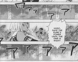
In the
Suikoden III manga
, Aki Shimizu raises the tension of an opposing army charging forward by connecting Lucia's word balloon to the adjacent panels. This gives us a sense that the enemy's war cry is ongoing (*and* getting louder - note the increasing size of the "aaaAAA" sound effect) as she instructs her son, Hugo, to make a critical choice.
Transparent word balloons - Used sparingly with thoughtful application, transparent word balloons can allow text to greater integrate with the imagery contained within the panel.
In these examples from
Fate/stay Night
, the transparent word balloons have a piercing effect, as if the words are going straight through the character as they are told something confusing, shocking, or unexpected.
Naoko Takeuchi uses transparent word balloons often in her
Sailor Moon
manga. I suspect that the effect is used more for aesthetic reasons, to integrate the balloons with the artwork in an attractive, non-intrusive way, like in this page featuring a full body illustration of Usagi. But it has the added effect of giving us a sense of being within Usagi's psyche as she reacts to information about a legend (the balloons contain voiceover dialogue from Rei).
In all of these examples, there's plenty of room where balloons could have been placed without obscuring the artwork, so I think it's safe to assume that they are intentionally transparent for effect.
Overlapping word balloons - Effective for indicating that a character is responding quickly, talking over, or interrupting another character.
Here's two examples from
Nana
by Ai Yazawa, one of my favorite mangaka. Showing the nuances of character interaction is one of her specialties.
In this panel, Yazawa uses the proximity of the word balloons to contrast between Nana's explosive outburst and Takumi's quick but cool-headed reaction.
In this panel, Junko's boyfriend Kyosuke adds detail to Junko's comment. The overlapping panels here give the impression that these romantically-involved characters are working together to build upon each other's thoughts.
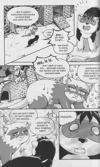
Finally, here's an example from my own book,
Peach Fuzz
(volume 3, pg 56). This page utilizes all three techniques:
Edwin and Peach are ferrets that don't see eye-to-eye in their needs, so while Peach is concerned with status and entitlement, Edwin is quick to get distracted by the presence of food. As Peach explains the layout of her kingdom in the first panel, Edwin perks up at the mention of food and interrupts her with an overlapping word balloon. His word balloon flows uninterrupted into the second panel, as we close in on Edwin's drooling face. Peach's response bridges the gap between the second and third panels as she explosively wrestles control of the conversation again. Finally, in the fourth panel, Peach's assumptions that Edwin has a kingdom of his own blend seamlessly into the sparkly background through the use of a transparent word balloon, showing us that she's caught up in her own fantasy.
In all of these cases, the style of the word balloons helps express the tone and intent of the character without ever sacrificing readability -- that's important. These techniques should not be used on every page, only when there is a need for it. To use word balloons effectively, I find that it's essential to plan out the word balloons at the same time I'm composing the actions and layout of a page - during the
roughing stage.
There's a *lot* more you can do with word balloons and lettering to enhance the story. I'll cover more of the basics and other creative techniques in a future post.


