I've read a number of blog posts listing lettering mistakes in the Twilight manga
Here are some examples from various manga to show you what I mean:
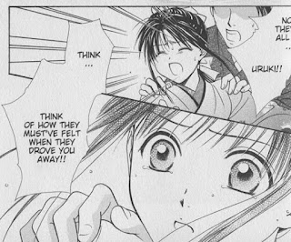
Word balloons bridging between two panels - This can be an effective and interesting way to transition between scenes, or tie two panels together for a greater emphasis of their connection to each other.
In this scene from Fushigi Yugi Genbu Kaiden
In the Suikoden III manga
Transparent word balloons - Used sparingly with thoughtful application, transparent word balloons can allow text to greater integrate with the imagery contained within the panel.
In these examples from Fate/stay Night
Naoko Takeuchi uses transparent word balloons often in her Sailor Moon
In all of these examples, there's plenty of room where balloons could have been placed without obscuring the artwork, so I think it's safe to assume that they are intentionally transparent for effect.
Overlapping word balloons - Effective for indicating that a character is responding quickly, talking over, or interrupting another character.
Here's two examples from Nana
In this panel, Yazawa uses the proximity of the word balloons to contrast between Nana's explosive outburst and Takumi's quick but cool-headed reaction.
In this panel, Junko's boyfriend Kyosuke adds detail to Junko's comment. The overlapping panels here give the impression that these romantically-involved characters are working together to build upon each other's thoughts.
Finally, here's an example from my own book, Peach Fuzz
Edwin and Peach are ferrets that don't see eye-to-eye in their needs, so while Peach is concerned with status and entitlement, Edwin is quick to get distracted by the presence of food. As Peach explains the layout of her kingdom in the first panel, Edwin perks up at the mention of food and interrupts her with an overlapping word balloon. His word balloon flows uninterrupted into the second panel, as we close in on Edwin's drooling face. Peach's response bridges the gap between the second and third panels as she explosively wrestles control of the conversation again. Finally, in the fourth panel, Peach's assumptions that Edwin has a kingdom of his own blend seamlessly into the sparkly background through the use of a transparent word balloon, showing us that she's caught up in her own fantasy.
In all of these cases, the style of the word balloons helps express the tone and intent of the character without ever sacrificing readability -- that's important. These techniques should not be used on every page, only when there is a need for it. To use word balloons effectively, I find that it's essential to plan out the word balloons at the same time I'm composing the actions and layout of a page - during the roughing stage.
There's a *lot* more you can do with word balloons and lettering to enhance the story. I'll cover more of the basics and other creative techniques in a future post.


It really surprised me that the Twlight Manga would be so roughly put together!
ReplyDeleteBy the way I love your blog!
Peach fuzz is a book I like to read
ReplyDeleteWhere can I read peach fuzz vol.3 online full version?
ReplyDeletePeach Fuzz Vol 3 is still available for purchase on Amazon. Here's the link!
Delete