Showing posts with label wip. Show all posts

Wednesday, May 23, 2012

New book - Sketchbook Confidential 2

I’m in a new book called Sketchbook Confidential 2, published by North Light Books.


It’s a really interesting art reference book that takes a peek into the sketchbooks of 38 different artists including myself, Tokyopop alumni Jared Hodges and Irene Flores, and others (many fine artists and painters). Each artist is showcased with several pages of WIP sketches, and their thoughts on sketching. Give it a flip through next time you’re at the bookstore.

Thursday, May 3, 2012

Underwater Bear

Thought I’d share a panel from the Last of the Polar Bears storyboards as I work on scanning all of them. The actual size of this drawing is only about two inches tall! I won’t be using this one in the comic, but I rather like it.

Sunday, April 29, 2012

Last of the Polar Bears storyboards

Finished the storyboards for all of The Last of the Polar Bears! Check out that giant stack of paper! Now to scan and compile...


You can read more about my storyboarding process here.
Download my comic template to use on your own projects here.

(Curious about the adorable bear plushie sitting behind the polar ball in the photo? That's Mr. Bear from Tea Club, made by my friend PMBQ.  There's also a Big Butt Panda variety. <3)

Thursday, November 18, 2010

Finding the Right Pose - Archie Character Designs

Recently, I put together some Archie character drawings to try out for a penciling position.

Archie Character Sheet (inks). Pencils by me, inked by Jared Hodges.

Finding the Look
Working with pre-existing characters is different than designing your own. I first had to familiarize myself with nuances of the "house style" to draw the characters on-model. I did this by sketching the characters, while carefully studing the spacing and proportions of their features, especially their faces.

Finding the Pose
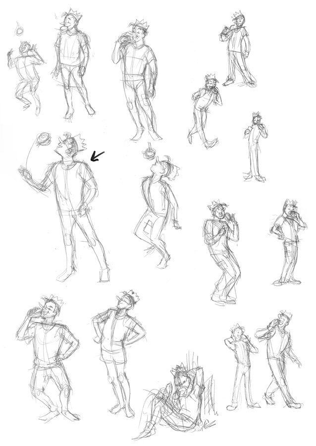
Once I felt comfortable drawing the characters, I did some thumbnail sketches for each character's pose, searching for the best character-appropriate gesture for each. It's worth noting that when I'm doing gesture sketches like this, I'm working small and fast. I'm not worried about proportions or details--that comes later. This is all about finding the pose.

Veronica
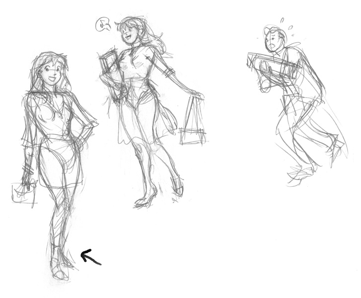
Veronica is the rich girl that pretty much gets what she wants. I decided to give her a hand-on-the-hip pose that emphasized her confidence and stylishness. For her outfit, a cute flirty dress, clutch handbag, and a bit of bling. I briefly entertained the idea of a more illustrative shopping scene for her (with bag carrying Archie in tow), but decided to stick with standalone poses.

Veronica poses
Betty
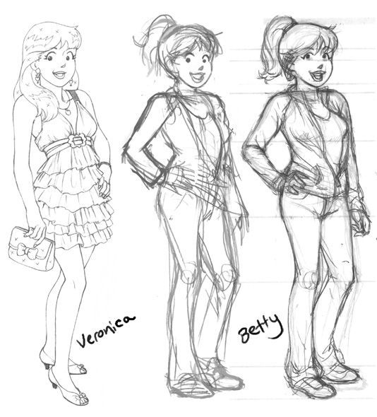
To contrast Veronica, I went with a sportier pose, and jeans and jacket outfit for Betty. I got pretty far in the drawing when I realized the pose was a bit too similar (hand-on-hip again) to Veronica's.

Betty - pose and rough pencils, next to finished Veronica for comparison.
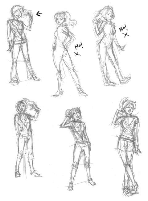
Keeping the keywords "cute" and "sporty" in mind, I started over. Of these, the first two I did (upper middle, upper right) weren't right at all for Betty -- too sexy; too cutesy. After that, I stopped and reconsidered the character. Sweet and sporty. I liked the gesture of Betty twirling a finger around her hair to showcase her ponytail, so I kept that in the rest of the sketches. I ended up going with my third attempt (first sketch on the top left).

More Betty poses
Archie
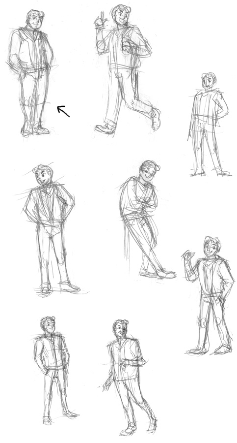
Archie's your average, nice guy character that everyone gets along with. For his pose I decided to show him "just hanging out".

Archie poses
Jughead
Jughead's the goofy comic relief character. To capture his cartoony mannerisms, I tried to push his poses towards the extreme (without going too far). I thought it would be funny to show him tossing an entire burger in his mouth the way you might with a piece of candy.

Jughead poses
Polishing the Art
Once I had my poses selected for each character, I printed out the sketches at a larger size with blue lines so I could do a clean pencil pass over them with their proper details and proportions.
And here's the finished results!

Thursday, December 17, 2009

The Last of the Polar Bears - promo poster

This is the promotional poster for The Last of the Polar Bears.

The Last of the Polar Bears is what will hopefully become my next graphic novel. I've spent the last year thinking about it and the last couple months writing and developing the groundwork for it. I just finished plotting out the story in detail from beginning to end, so now I'm ready to move forward with the creation of the comic itself!

This promo illustration, portraying an iconic scene from the first chapter of the story, had a pack a lot of punch with a minimalist execution. With so little detail, it wasn't difficult to draw, but every aspect of it needed to be just right.

I find it very helpful to create a number of tiny thumbnail sketches, to quickly try out different takes on an idea. Working with a general idea of a polar bear cub poking his head out of the den for the first time, finding himself surrounded by an unending sea of white snow, I created a couple of concept sketches:
In these examples, note how composition, placement, and size of the cub play a big role in mood and feel.

#1 is a strong close up on the cub's face, grinning as he takes a peek at the outside world - cute, but completely at odds with the title of the book.

#3 is closer in feel - the landscape is vast, the cub is small--there's a real sense of loneliness going on, but it's so far pulled out from the character that scene no longer feels intimate.

#2 is almost right on target. The cub is cute and awestruck without looking too giddy. But the centered figure is boring and predictable.

#4 takes the aspects of #2 that I liked, but moves the cub into the lower corner. The title is placed in the upper right corner to balance the piece.

Once I had the composition figured out, I set about drawing the character.

He went through several drafts (including some slight variations with him smiling, not shown here) before I finally hit upon a version that worked for the poster.
And here you have it, the finished line art of the cub seen in the poster (flipped in the illustration):

Stay tuned for lots more. I look forward to introducing you to this little guy and the rest of his family. :)

Monday, August 17, 2009

Ballerina - WIP

Yes, I'm back to the ballet theme again! :) Here are some studies I did while watching ballet performances.


So what are the sketches for? Figure drawing practice and warm-ups for my next picture, a sequence of dance moves starring this character. I should be finished with it tomorrow. Stay tuned!

Friday, July 10, 2009

Treasure - WIP

Here's the next piece I am working on for my portfolio. This one will be getting a black and white treatment rather than color.


By the way, for any artists who want to take part in the daily speedpainting exercises I've been doing, here's the photos so far. Aside from the photo of the dog (speedpaint 10, which was taken by its owner), they are all my photos. I've been selecting them based on various challenges (fur, foliage, water, reflections, interiors, lighting, etc). If you decide to participate, I recommend focusing in on a portion of the photo rather then trying to paint the whole thing. Have fun! :)

Tuesday, June 30, 2009

Nature Speed Paints + Boy and Gator 3 WIP

Here is where I currently am on the final Boy + Gator piece. I'm working my way down from top. The treetops and distant background details are done. Tomorrow, I plan on tackling the tree trunks and ground areas.


To brush up on my foliage painting abilities for the illustration, I did a couple of speed paintings, referenced from photos in my personal archive.


This was the view from my window at the last apartment I lived in. Photoshop CS3, 30 minutes.


Photoshop CS3, 50 minutes.

Watch me create the piece on livestream:

Wednesday, June 17, 2009

Boy and His Gator WIP 3

Final picture in the series!


Tearfully, the boy returns the baby gator where he found it. Wild things belong in the wild. Aww.

The background lineart is rough because I intend to express the background details during the coloring phase. It's been my experience that lines tend to get in the way when it comes to organic scenery.

The Florida Everglades will be my point of reference for this background. As unlikable as this place can be in the summer (soooo hot outside right now), I'm excited for an opportunity to feature my home state in an illustration. :)

Tuesday, June 16, 2009

Boy and His Gator WIP 2

"Not in MY house, young man!"


Picture #2 for Boy and His Gator. Out of necessity to get Mom properly placed in the picture, and still show her displeased hand-on-hip body language, I changed the orientation. I had originally planned to make all the pictures in the series the same size, but a taller format just works better in this case.

Just one more to go and then I move on to coloring.

Monday, June 15, 2009

Boy and His Gator WIP 1


Here's the first drawing in a series of three about a boy and his pet gator. Who hasn't wished they could have an alligator for a pet? :)

Incidentally, I was at a park the other day, and had set down my purse for a moment to feed some seeds to a squirrel. When I picked up my purse, I discovered a small stowaway--no, not an alligator, haha--a baby lizard. When I tried to remove him, he scurried onto my hand and up to my shoulder and tilted his head to give me a seemingly quizzical look. I instantly fell in love with the little guy. Of course, I couldn't keep him, but I walked around with him for a bit before depositing him on a bush. He didn't want to leave. Friendliest baby lizard I've ever met. Good luck in your adventures, little lizard! *sniff*

Anyways, back to the drawing, I'm planning on drawing all three one after the other, and then doing the same with the coloring process. If I'm satisfied with the finished picture, the first one might just become the new picture for my next promotional postcard.


Here's a sneak peek at the roughs for the other two:

Wednesday, June 3, 2009

Red Shoes WIP 1

Here's my next project for the portfolio: A mock book cover based on the Hans Christian Andersen fairy tale The Red Shoes. From my childhood, I recalled the story being about a girl who puts on a pair of red ballet slippers that force her to dance until she dies from exhaustion. Upon reading the actual story as part of my research for the illustration, however, I was surprised to learn that the original version of the tale is quite different, with some pretty heavy Christian symbolism and morality. In any case, the story has some nice visual elements in it.

Yesterday I did some warm up sketches of dancers and ballerinas. Ballerinas have wonderful poses with strong silhouettes. Very inspiring. I hope to capture some of that in the final piece.

Afterwards, I started working out some thumbnails, figuring out how to arrange the visual elements I wanted to show into a compelling book cover. I settled on the one with a star next to it (lower left corner), and serendipitously stumbled upon a back cover design as well. I think it'll make for a nice companion piece.

Tuesday, May 26, 2009

Baking Cookies With Mom WIP 3

Ok, whew! The comic assignments are done, so I'm back to work on the portfolio. Picking up where I left off, here's the completed line art for "Baking Cookies With Mom" (Previously titled "Mother's Day"). Lots of general tweaks. Cleaned up line work, finished character art, made some corrections to Mom's anatomy, gave her a wardrobe change and turned the nondescript puppy into a pug (I love pugs; they're so adorable and...pugly!).


Next up, colors! Once this piece is done, the next thing I'm going to tackle is my interpretation of a classic fairy tale in a mock book cover format. Should be fun. :)

Wednesday, May 6, 2009

Mother's Day WIP 2

Here's the rough draft for the Mother's Day piece:


Mmm, cookies!

There's still a lot to do. Need to put some more stuff in the corner of the countertop--maybe a mixer or some other appliance. I also need to add the tile floor, and of course sharpen and refine the lines on the characters. I'm currently working at 8.5x11, but I'll probably do a final pencil pass at a larger size.

For now though, it's back to work on the comic assignment. I spent today getting all the thumbnails together and fixed up. Tomorrow, I start penciling the first page of the new chapter.

Sunday, May 3, 2009

Mother's Day WIP 1

With Mother's Day right around the corner, for my next portfolio piece, I decided to center my idea around "spending time with Mom". I have fond memories of my mom teaching me how to make lemon meringue pies and chocolate chip cookies; working together to make something delicious.

I had a couple different ideas for how to approach the concept:In the first two, the kids are baking cookies (and making a giant mother's day card in #2) to surprise Mom. I think these are fun ideas, but then I remembered that part of the purpose of this piece was to demonstrate my ability to draw an adult figure in addition to the kids.

In #3, the little girl is breaking an egg into the bowl while the younger brother "supervises", and mom offers guidance (and the puppy waits for treats).

Finally, in #4, mom assists the girl in putting the cookies in the oven while younger brother eats/drips cookie dough in the background.

I've decided to go with 4 since it has a lot of fun elements to it.

Unfortunately, I'm not sure if I'll be able to find the time to finish it before Mother's Day. But we shall see! After all, I didn't expect to finish Polar Pal today. It all depends on my comic schedule. Stay tuned for more progress.

Friday, May 1, 2009

Polar Pal WIP 2

I ended up going with my third idea, even though it was the least exciting angle. It occurred to me that painting the aurora borealis in the sky would make for a really nice effect. Thanks to Chan for the inspiration. Your comment about the moon gave me the idea. :)

I got the go-ahead on the next comic from my editor, so the colors are on hold for the time being, but at least I got the drawing done. :)

Polar Pal WIP 1

While I'm waiting for the go-ahead to begin pencils for the next chapter of secret-comic-project, I thought I'd work on another piece for my children's illustration portfolio.

The original idea for this one was to have an Eskimo boy encountering a miniature polar bear in the snow. I liked the concept of having a small boy tower over what would normally be a very large animal. The miniature bear came across as confusing though, so in this revised version, the polar bear has been enlarged to make it polar cub size instead.Jared suggested I work a fish into the composition to add further depth to the scene and give the polar bear cub a reason to approach the boy. So here's where the idea currently is with these three compositions:
Each has a slightly different feel. I'm currently leaning towards the middle one since you get to see both character's faces. But I'm curious to hear other opinions. Does anyone have a favorite?