Thursday, December 31, 2009
Polar Bear Postcard
Here is the second illustration I've done for The Last of the Polar Bears, a new graphic novel I've been working on. You can read a little bit more about it and see the first illustration here.
This illustration was created for the back of my new winter promo postcard to celebrate the new year. If you'd like a copy of the new postcard, sign up here to receive it (yes, it's free, so don't be shy!).
Thursday, December 24, 2009
2009 Art Year in Review
In January and February, I was finishing up my how-to draw book, Draw Furries - How to Create Anthropomorphic and Fantasy Animals (more info). I started experimenting with coloring over pencil lines (as opposed to inked) in Draw Furries. I thought it wouldn't work because I'd tried it in the past and it looked sloppy (for example, pencil illo from 2006), but as it turns out, that's just because the pencil lines were sloppy. My line art is much cleaner and refined now, so adding colors works fine (and suits me because I enjoy penciling a lot more than inking).
In March, I began working on my children's illustration portfolio, which I continued to work on till August.
In April through June, I worked on two chapters of Domo: The Manga for Tokyopop. With it came an opportunity to try my hand at color comics, something I had been thinking about doing for a while. I really like the results. I still love black-and-white comics, but I don't think one should limit themselves to black-and-white if color makes sense for the project.
I started doing 1-hour speed paints in June, around the time I started the Boy and Gator illustration series, when I realized that I didn't have a good technique for painting trees, and as a result the background in this image was taking me much longer than it should. Since then, I've tried to do that daily speed paints, when time allows, and have practiced everything from water reflections to realistic portraits of dogs.
In July, not pictured here, I did some Sonic the Hedgehog "Off Panel" comic strips for Archie. That was a blast from the past for me, as I spent a lot of my teenage years with my cousin making little Sonic fan comics. I think the strips are currently running in the back of the Sonic the Hedgehog comics, up through issue 208.
In September through November, I turned my focus onto a new comic project, and started doing a lot of research and development for it. Writing, sketching, character designs, etc. Because of this, the only color work I did was in the form of 1-hour speed paintings. November's speed paint is a Christmas gift for my aunt.
Finally, in December, I finished my promotional poster illustration for The Last of the Polar Bears - the new graphic novel I'd been developing the last three months, and will be continuing to work on in 2010.
Here's links to the illustrations featured in the 2009 Summary of Art:
January
February
March
April
May
June
July
August
September
October
November
December
Blank 2009 Art Summary MEME comes from: http://audreydutroux.deviantart.com/art/MEME-2009-Summary-blank-147170285
Thursday, December 17, 2009
The Last of the Polar Bears - promo poster
This is the promotional poster for The Last of the Polar Bears.
The Last of the Polar Bears is what will hopefully become my next graphic novel. I've spent the last year thinking about it and the last couple months writing and developing the groundwork for it. I just finished plotting out the story in detail from beginning to end, so now I'm ready to move forward with the creation of the comic itself!
This promo illustration, portraying an iconic scene from the first chapter of the story, had a pack a lot of punch with a minimalist execution. With so little detail, it wasn't difficult to draw, but every aspect of it needed to be just right.
I find it very helpful to create a number of tiny thumbnail sketches, to quickly try out different takes on an idea. Working with a general idea of a polar bear cub poking his head out of the den for the first time, finding himself surrounded by an unending sea of white snow, I created a couple of concept sketches:
In these examples, note how composition, placement, and size of the cub play a big role in mood and feel.
#1 is a strong close up on the cub's face, grinning as he takes a peek at the outside world - cute, but completely at odds with the title of the book.
#3 is closer in feel - the landscape is vast, the cub is small--there's a real sense of loneliness going on, but it's so far pulled out from the character that scene no longer feels intimate.
#2 is almost right on target. The cub is cute and awestruck without looking too giddy. But the centered figure is boring and predictable.
#4 takes the aspects of #2 that I liked, but moves the cub into the lower corner. The title is placed in the upper right corner to balance the piece.
Once I had the composition figured out, I set about drawing the character.
He went through several drafts (including some slight variations with him smiling, not shown here) before I finally hit upon a version that worked for the poster.
And here you have it, the finished line art of the cub seen in the poster (flipped in the illustration):
Stay tuned for lots more. I look forward to introducing you to this little guy and the rest of his family. :)
Thursday, December 10, 2009
Speedpaint 29 - Angry Gorilla
Today's speedpaint is a stern looking gorilla from Disney's Animal Kingdom. I find the human similarities in apes and monkeys fascinating. Their facial expressions especially. Perhaps because of how expressive they can be, I couldn't help but feel bad for this guy. He was looking out at the people passing by with such a fierce and unhappy expression, like he couldn't put his guard down with everyone around. Or maybe gorillas are like this in the wild too? In any case, it makes me think about the implications of keeping animals in captivity. Not that I'm anti-zoo or anything. They allow people to view and appreciate animals that they wouldn't otherwise have an opportunity to see and I enjoy sketching zoo animals.
My clock crashed when I was working on this one, so I don't have an exact time but I think it took me about an hour and 20 minutes. Photoshop CS3.
Here's a bonus speedpaint. A sheet draped on the floor, 16 minutes.
Tuesday, December 8, 2009
Speedpaint 28 - Thanksgiving Charly
Another Christmas present. This one's for Charly's owner. :D
Photoshop CS3, about 1 hour 10 minutes.
Charly the Shih Tzu was also the subject of my very first speed painting attempt earlier in the year.
Friday, December 4, 2009
Speedpaint 27 - Thanksgiving Tiki
This is a painting of my parent's cat, Tiki. Like the last picture I posted, this is also going to be a Christmas gift. I got caught up in the details and ended up spending about two and half hours on it (I broke my own speedpaint rule of "Work at 50% and never zoom in", so it's super detailed even at 200% zoom).
In case any one is wondering, I should clarify that these paintings are done primarily for practice. I haven't lost my mind or given up comics or completely overhauled my art style or anything like that. Just trying to challenge myself and pick up some new techniques to use in the future on actual work.
For the past couple months, I've been focusing very intensely on a new graphic novel pitch. I've put a great deal of work into it so far: research, detailed chapter-by-chapter synopsis, in-depth character descriptions and histories, mountains of sketches, and character designs. Thing is, that's all behind-the-scenes stuff that I can't share. I have one more chapter to go on the synopsis, and the ending has been set since almost the beginning, so it's just a matter of fleshing out the final part. Then I can move onto scripting and storyboarding the first chapter. This new story is something I've been thinking of since last year, so it's really exciting to see it all coming together. I should have a lot more to show in the upcoming months. :)
Monday, November 30, 2009
Speedpaint 26 - Aunt Carol
This started out with the intention of being a speed paint, but became a "slow paint" when I realized that I'd need to be more meticulous to get an accurate likeness. I've been picking away at it slowly for about the last week. I believe I put about five or six hours into it total. It's a Christmas present for my Aunt Carol, of her and her new boyfriend (reffed from a photo). She wanted it 8.5"x11" size, which also made it more time-consuming (previous speed paints were done 4"x6").
The most difficult part of the picture was probably the hand. I don't usually have too much trouble drawing hands, but attempting to depict one with color and volume without the help of an underdrawing or lineart...very frustrating. It went through a couple revisions.
It's probably obvious that realistic painted portraits are not my area of expertise (this is my first attempt since...high school, I think?) but hopefully Aunt Carol likes it.
Monday, November 23, 2009
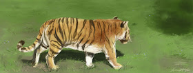
Speedpaint 25 - Tiger 2
I downloaded some new texture brushes the other day. Thought I'd do a close-up of a tiger to figure out some fur painting techniques. Haven't figured out a technique that works yet, but it's a start. I'll keep working at it.
This time I painted the figure before the background. I wanted to put all my time and effort into the tiger since he was the primary focus of the composition. I used less saturated colors on the background to try to get the tiger to "pop" more.
Photoshop CS3, 59 minutes.
Sunday, November 22, 2009
Speedpaint 24 - Tiger
For this speedpaint, I tried a different approach. As always, I work from back to front, blocking in the background before moving onto the figure. The difference is that this time, I started with the lightest colors and built up to the darkest shades (sort of like using watercolors), whereas in previous pieces, I started with my darkest colors first, and worked up to my lightest colors. As a result, the finished piece has a slightly more pastel color palette.
Photoshop CS3, 45 minutes.
Saturday, November 14, 2009
Speedpaint 23 - Komodo Dragon
Finding a method for quickly painting reptilian scales proved difficult, so this is yesterday and today's speed paint. I did the background and basic body structure on the Komodo dragon yesterday, and then some retouching and scale texture today. I believe in total it took about an hour and a half. I'm not quite satisfied with the results, but that's not the point of these exercises. It's to expose myself to new challenges.
I think I'm in a rut with the greens and browns. I'll try to work some different colors into the next one.
Thursday, November 12, 2009
Speedpaint 22 - Crow on Turquoise
New speedpainting. Going to try to get back into the habit of doing one a day again. :)
It was my birthday on the 9th. I turned 28. I went to Animal Kingdom to celebrate, where I encountered this crow. It looks like he's standing on water, but it's actually a solid object that's been painted to look like water.
Photoshop CS3, 1 hour, 9 minutes
Soundtrack: Joe Hisaishi - Studio Ghibli Concert 2008; Ghibli to Issho
Sunday, November 1, 2009
Draw Furries: New Book!
I'm proud to announce the upcoming release of Draw Furries - How to Create Anthropomorphic and Fantasy Animals written and illustrated by me and Jared Hodges, published by Impact Books!
In a nutshell, Draw Furries goes over drawing anthropomorphic and animal characters. It's 128 full-color pages, covering step-by-step anatomy, poses, and species-specific details (wings, tails, eyes...) for feline, canine, equine, rodent and avian characters, plus coloring and backgrounds! The book also includes a bonus guest gallery featuring art by the very talented Bara-chan, Kelly Hamilton, CookingPeach aka Miu, and Makime!
Here's some sample spreads from the book:
The book comes out the beginning of December!
Wednesday, October 14, 2009
Tuesday, September 22, 2009
Speedpaint 21 - Ducklets
Monday, August 31, 2009
Domo: The Manga - out in stores tomorrow!
The Domo: The Manga book I worked on is coming out tomorrow. It should be available in bookstores nationwide in the manga/graphic novel section! It's a full-color graphic novel published by Tokyopop involving that lovable brown monster guy with the big mouth! All the stories are lighthearted and fun, perfect for kids and great for fans of Domo and/or funny animal stories.
Two chapters in the book were done by me and Jared Hodges (pencils = me, Jared = colors).
Thursday, August 27, 2009
Wednesday, August 26, 2009
Caution Creatures - Complete
A smorgasbord of poisonous/venomous creatures for the Illustration Friday prompt "caution". Represented are the black widow spider, poison dart frog, coral snake, blue ring octopus, puffer fish, wasp, and box jellyfish (Not to scale with each other). :)
The picture was fun to do, but took longer than expected to finish it... probably because my working size was 8"x6" at 600 dpi, so I ended up making it far more detailed than necessary. Whoops.
Pencil + coloring in Photoshop CS3
Thursday, August 20, 2009
Tuesday, August 18, 2009
Monday, August 17, 2009
Ballerina - WIP
Friday, August 14, 2009
Invasion WIP 1
Here's a sneak peak cropping of the picture I plan on finishing up today.
These are the thumbnail sketches for the picture.
I decided to go with number 3 since it has the most action (boy leaping in the air), though I'm also fond of 1 and 2.
1 has a nice diagonal cut of water creeping into the image, and so many crabs that he is no place to put his other foot. Downsides - seems too posed, and the right leg pulled back almost looks like he's getting ready to kick crabs, which isn't my intention.
2 has a funny action of the boy pulling up his foot after a crab has snipped at it, causing the crab to also be launched into the air. I strongly considered it, but 3 won out for the stronger action and the sense that the crabs somehow snuck up on him.
Tuesday, August 11, 2009
From the Sketchbook - studies of polar bears and beetles
The polar bear studies are based upon photos I took at the New York Central Park zoo, with the exception of Knut, the famous polar bear from Germany -- too irresistibly cute not to draw. :)
The beetle studies were done for one of the Domo manga chapters in which Domo catches himself a kabuto mushi, aka a Rhinoceros beetle. They're popular in Japan and sometimes used in fighting tournaments. Before I could "toonify" the beetle's design, I made sure to do a number of drawings of the actual insect so that I better understood what I was drawing.
The final design ended up being just a tad different than the sketches here. See if you can tell the difference when the book comes out!
Monday, August 10, 2009
Can't Wait to Grow Up!
For the Illustration Friday prompt "impatience". This girl wants to hurry up and grow into an adult so that she can be just like her mother.
A number of ideas came to mind for illustrating the word "impatience": a boy cutting in the lunch line, a group of kids being served cupcakes, while one of the kids complains about the wait, or a kid yelling at another one to let him have his turn on a ride... but then this final idea popped into my head, I liked it because it presented a different take on the word with a positive spin.
Tuesday, August 4, 2009
Speedpaint 20 - Momoko
Friday, July 31, 2009
Speedpaint 18 and 19 - Sea Lion and Snowy Egret
Snowy Egret found wandering around at Sea World.
Photoshop CS3, 35 minutes.
Soundtrack: FINAL FANTASY SONG BOOK mahoroba
California Sea Lion at NY Central Park Zoo.
Photoshop CS3, 35 minutes.
Soundtrack: Seiken Densetsu 2 OST (sorry about the constant clicking noise - livestream kept refreshing a banner for some reason)
Tuesday, July 28, 2009
Speedpaint 16 and 17 - Monkey and 4th of July
This is a Snow monkey aka Japanese Macaque from the Central Park Zoo in NYC.
Photoshop CS3, 46 minutes.
Soundtrack: Donkey Kong Country 1 OST
This speed paint is incomplete. The scene I was working on was filled with wall-to-wall people (it was taken at Crane's Roost this year on the Fourth of July). My meticulous approach to the human figures, and all the color variation in clothing slowed me down immensely. After an hour, I still had a great deal of the scene left to do, and I had lots of work to do that day, so I called it quits.
Photoshop CS3, 53 minutes.
Soundtrack: Chrono Cross OST
Wednesday, July 15, 2009
Treasure - Complete
Monday, July 13, 2009
Speedpaint 15 - Tiki
This is my parent's cat, Tiki. I wasn't quite able to capture her likeness or the blanket texture, but given the time limit, I think it's a satisfactory first attempt. Tiki, by the way, is not a particularly cuddly cat. Don't be fooled by her cute sleeping pose. :)
Photoshop CS3, 57 minutes.
Soundtrack: ANNA TSUCHIYA inspi' NANA and OLIVIA inspi' REIRA (from Nana)
Sunday, July 12, 2009
Saturday, July 11, 2009
Speedpaint 13 - Still Life
This one was loaded with details, so I broke it up into two sessions. Yesterday morning, I painted the background using a soft round brush to give everything a soft focus, and today I came back to finish the foreground details using my standard detailer brush (hardness at 100% and a hint of noise texture) and a bit of the airbrush.
Part 1:
Photoshop CS3, 48 minutes.
Soundtrack: Brazil Classics, Vol. 1: Beleza Tropical (a favorite from my childhood)
Part 2:
Photoshop CS3, 47 minutes.
Soundtrack: Juuni Kokki OST