

Showing posts with label comics. Show all posts
Showing posts with label comics. Show all posts
Sunday, October 20, 2013
Sea Kitten
Sea Kitten! A miniature comic I did about a tiny horned aquatic cat. For a tutorial about using comic panels to show action, featured in the June 2013 issue of ImagineFX's Fantasy and Sci-Fi Digital Art magazine. Sea Kitten!


Monday, December 3, 2012
Lessons from the Ice

Sunday, December 2, 2012

Friday, September 2, 2011
Down in Fraggle Rock
The Fraggle Rock: Tails and Tales graphic novel is now in bookstores! The anthology includes a comic and back cover illustration drawn and colored by me. Hardcover, 128 full color pages. For readers of all ages. Photos below courtesy of my cousin, Chandra Free, whose own Fraggle Rock comic appears right beside mine in the book! :)


Wednesday, November 24, 2010
The Last of the Polar Bears pgs 30-31

I updated www.lastpolarbears.com with pgs 30-31. Who might those mysterious paw prints belong to?
Other mini-announcement: I’m currently working on a short Fraggle Rock comic for Archaia. :)
Monday, September 20, 2010
The Last of the Polar Bears pgs 28-29

I updated www.lastpolarbears.com with pgs 28-29. Stella discovers the joy of leaving pawprints in the snow.
If you're relying on my blog for updates, pgs 26-27 will also be new to you. :)
Monday, September 6, 2010
The Last of the Polar Bears pgs 24-25

I updated www.lastpolarbears.com with pgs 24-25. Stella is ready for adventure. Nanook isn't.
If you're relying on this blog for updates, pgs 22-23 will also be new to you. :)
Friday, July 23, 2010
Illustration Friday: "Double"

Thursday, July 15, 2010
Last of the Polar Bears - now a webcomic

I wanted to let all of you know that I've started posting pages of The Last of the Polar Bears online as a web comic. I plan to post a new double-page spread every week, on Mondays, as well as write about the process of making comics as time allows. You can read The Last of the Polar Bears comic here: www.lastpolarbears.com.
Why the webcomic format?
I started working on The Last of the Polar Bears a year ago, researching, plotting the story from beginning to end, designing the characters, and working on the sequential art. After storyboarding the first chapter, I determined the complete story would be around 500 pages--meaning it could take years before the book would be ready for publication.I strongly believe in The Last of the Polar Bears and its message, so rather than keeping the project hidden for the next several years while I continue to work on it, I've decided to make the pages available to readers as they are created. I'd love to hear your feedback. :)
P.S. If you know anyone who might also enjoy the comic, please pass along the link to them! Thanks and enjoy! :)
Wednesday, May 19, 2010
Last of the Polar Bears - pages 1-3
It's been a while since I last posted any tidbits about The Last of the Polar Bears graphic novel am working on, so here's a quick update. The proposal is currently making its rounds with agents. In the meantime, I'm continuing to work on more comic pages. I wanted to share the first few pages with all of you. A sweet little scene showing Nanook and Stella as itty-bitty baby polar bears!
Enjoy!
(Something fun to note is that all of the panel borders on these pages are "hand-drawn", that is, without the benefit of rulers. I wanted them to have a very organic, rough quality to them. That's why they have little squiggles and imperfections. Requiring a very steady hand, they take a lot longer to do, but I love the effect.)


Enjoy!
(Something fun to note is that all of the panel borders on these pages are "hand-drawn", that is, without the benefit of rulers. I wanted them to have a very organic, rough quality to them. That's why they have little squiggles and imperfections. Requiring a very steady hand, they take a lot longer to do, but I love the effect.)


Friday, February 5, 2010
Creative Lettering in Comics
There has recently been a lot of scrutiny over the quality of lettering in the Twilight manga adaption. From what I've seen, I don't disagree. The lettering is lackluster, difficult to read and feels like an afterthought-- word balloons seem to be transparent and awkwardly placed for no other reason than simply because there wasn't any space allotted for them when the artist made the page. For example, the second panel of this sample page shows two hands touching over a microscope, but a word balloon has been plopped over top of it, covering the primary focus of the panel with dialogue.
I've read a number of blog posts listing lettering mistakes in the Twilight manga . But while there are basic guidelines for readability, lettering is not an exact science. As with other art forms, the art of lettering is subjective. Some of the techniques that have been identified by some bloggers as "wrong", such as word balloons bridging multiple panels, transparent word balloons, and overlapping word balloons, can actually be used to good effect under the right circumstances.
Here are some examples from various manga to show you what I mean:
Word balloons bridging between two panels - This can be an effective and interesting way to transition between scenes, or tie two panels together for a greater emphasis of their connection to each other.
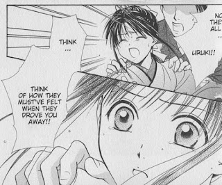
In this scene from Fushigi Yugi Genbu Kaiden by Watase Yuu, we see Takiko's change in reaction over two panels as another character gives her insight into the reasons behind an earlier event. The bridging word balloon makes the transition feel smoother and her reaction immediate, as the other character is speaking. Breaking up the dialogue into two separate balloons would have changed the timing of her reaction.

In the Suikoden III manga , Aki Shimizu raises the tension of an opposing army charging forward by connecting Lucia's word balloon to the adjacent panels. This gives us a sense that the enemy's war cry is ongoing (*and* getting louder - note the increasing size of the "aaaAAA" sound effect) as she instructs her son, Hugo, to make a critical choice.
Transparent word balloons - Used sparingly with thoughtful application, transparent word balloons can allow text to greater integrate with the imagery contained within the panel.


In these examples from Fate/stay Night , the transparent word balloons have a piercing effect, as if the words are going straight through the character as they are told something confusing, shocking, or unexpected.

Naoko Takeuchi uses transparent word balloons often in her Sailor Moon manga. I suspect that the effect is used more for aesthetic reasons, to integrate the balloons with the artwork in an attractive, non-intrusive way, like in this page featuring a full body illustration of Usagi. But it has the added effect of giving us a sense of being within Usagi's psyche as she reacts to information about a legend (the balloons contain voiceover dialogue from Rei).
In all of these examples, there's plenty of room where balloons could have been placed without obscuring the artwork, so I think it's safe to assume that they are intentionally transparent for effect.
Overlapping word balloons - Effective for indicating that a character is responding quickly, talking over, or interrupting another character.
Here's two examples from Nana by Ai Yazawa, one of my favorite mangaka. Showing the nuances of character interaction is one of her specialties.

In this panel, Yazawa uses the proximity of the word balloons to contrast between Nana's explosive outburst and Takumi's quick but cool-headed reaction.

In this panel, Junko's boyfriend Kyosuke adds detail to Junko's comment. The overlapping panels here give the impression that these romantically-involved characters are working together to build upon each other's thoughts.
Finally, here's an example from my own book, Peach Fuzz (volume 3, pg 56). This page utilizes all three techniques:
 Edwin and Peach are ferrets that don't see eye-to-eye in their needs, so while Peach is concerned with status and entitlement, Edwin is quick to get distracted by the presence of food. As Peach explains the layout of her kingdom in the first panel, Edwin perks up at the mention of food and interrupts her with an overlapping word balloon. His word balloon flows uninterrupted into the second panel, as we close in on Edwin's drooling face. Peach's response bridges the gap between the second and third panels as she explosively wrestles control of the conversation again. Finally, in the fourth panel, Peach's assumptions that Edwin has a kingdom of his own blend seamlessly into the sparkly background through the use of a transparent word balloon, showing us that she's caught up in her own fantasy.
In all of these cases, the style of the word balloons helps express the tone and intent of the character without ever sacrificing readability -- that's important. These techniques should not be used on every page, only when there is a need for it. To use word balloons effectively, I find that it's essential to plan out the word balloons at the same time I'm composing the actions and layout of a page - during the roughing stage.
There's a *lot* more you can do with word balloons and lettering to enhance the story. I'll cover more of the basics and other creative techniques in a future post.
I've read a number of blog posts listing lettering mistakes in the Twilight manga
. But while there are basic guidelines for readability, lettering is not an exact science. As with other art forms, the art of lettering is subjective. Some of the techniques that have been identified by some bloggers as "wrong", such as word balloons bridging multiple panels, transparent word balloons, and overlapping word balloons, can actually be used to good effect under the right circumstances.Here are some examples from various manga to show you what I mean:
Word balloons bridging between two panels - This can be an effective and interesting way to transition between scenes, or tie two panels together for a greater emphasis of their connection to each other.

In this scene from Fushigi Yugi Genbu Kaiden
by Watase Yuu, we see Takiko's change in reaction over two panels as another character gives her insight into the reasons behind an earlier event. The bridging word balloon makes the transition feel smoother and her reaction immediate, as the other character is speaking. Breaking up the dialogue into two separate balloons would have changed the timing of her reaction.
In the Suikoden III manga
, Aki Shimizu raises the tension of an opposing army charging forward by connecting Lucia's word balloon to the adjacent panels. This gives us a sense that the enemy's war cry is ongoing (*and* getting louder - note the increasing size of the "aaaAAA" sound effect) as she instructs her son, Hugo, to make a critical choice.Transparent word balloons - Used sparingly with thoughtful application, transparent word balloons can allow text to greater integrate with the imagery contained within the panel.


In these examples from Fate/stay Night
, the transparent word balloons have a piercing effect, as if the words are going straight through the character as they are told something confusing, shocking, or unexpected.
Naoko Takeuchi uses transparent word balloons often in her Sailor Moon
manga. I suspect that the effect is used more for aesthetic reasons, to integrate the balloons with the artwork in an attractive, non-intrusive way, like in this page featuring a full body illustration of Usagi. But it has the added effect of giving us a sense of being within Usagi's psyche as she reacts to information about a legend (the balloons contain voiceover dialogue from Rei).In all of these examples, there's plenty of room where balloons could have been placed without obscuring the artwork, so I think it's safe to assume that they are intentionally transparent for effect.
Overlapping word balloons - Effective for indicating that a character is responding quickly, talking over, or interrupting another character.
Here's two examples from Nana
by Ai Yazawa, one of my favorite mangaka. Showing the nuances of character interaction is one of her specialties.
In this panel, Yazawa uses the proximity of the word balloons to contrast between Nana's explosive outburst and Takumi's quick but cool-headed reaction.

In this panel, Junko's boyfriend Kyosuke adds detail to Junko's comment. The overlapping panels here give the impression that these romantically-involved characters are working together to build upon each other's thoughts.
Finally, here's an example from my own book, Peach Fuzz
(volume 3, pg 56). This page utilizes all three techniques: 
In all of these cases, the style of the word balloons helps express the tone and intent of the character without ever sacrificing readability -- that's important. These techniques should not be used on every page, only when there is a need for it. To use word balloons effectively, I find that it's essential to plan out the word balloons at the same time I'm composing the actions and layout of a page - during the roughing stage.
There's a *lot* more you can do with word balloons and lettering to enhance the story. I'll cover more of the basics and other creative techniques in a future post.
Tuesday, February 2, 2010
Breaking into Comics

One of the questions I'm frequently asked is how to go about "breaking into" the comic industry. It's a tricky question to answer, because there is no direct path. The comics industry is a tough business to break into. There's a lot of competition. And even once you're "in", every new assignment or project still requires effort to get (though publishing credits do help!).
The most important thing you'll need are strong, stand-out sample comic pages that demonstrate your skills in sequential art. The ability to draw characters consistently on-model and capable of expressing a gamut of emotions, backgrounds in perspective, clarity in sequential storytelling, dynamic action, clear but exciting panel layouts, and so on. The best way to get that is to keep working at it. The more you draw, the better you'll get. Challenge yourself to draw outside of your comfort zone. Draw everything, not just people. The ability to draw human characters is, of course, essential, but comic artists should ALSO be able to draw whatever the script calls for: backgrounds from busy cityscapes to dense forests, cute puppies to ferocious beasts, racing cars to horse-drawn wagons.
Depending on the publisher, the way to get your work seen is to take it to a convention where an editor is doing portfolio reviews. They can give you the feedback you need to further improve your pages, or if your work is good enough, hire you on the spot.
The way I got my start with Tokyopop was through their 2nd Rising Stars of Manga competition. (I'm not sure if they're still doing the Rising Stars of Manga, but nowadays there are also other competitions running such as Kodansha’s Morning Magazine International Comic Contest, in which Jared's and my entry, Last Dance, placed as a finalist, and DC's Zuda Comics, which I have not personally entered).
For RSOM, I followed the guidelines, and sent off a short self-contained 20-page comic that landed me grand prize. The editors loved it so much that they asked me to put together a full three-volume version of the series. You know how that turned out. The series was Peach Fuzz. :) From there, I had the credentials and work behind me to get a job as a penciler over at Archie Comics.
If you're interested in writing and drawing stories, the steps are similar but somewhat different. You'll need to put together a comic pitch based on your desired publisher's guidelines. Every publisher is different about what they want. It helps to be aware of which publishers are looking for submissions, and what they want, so that you can tailor your submission to their needs. Check publisher websites for guidelines. But in general, it amounts to about 10-15 sample comic pages, a short (2-3 page) synopsis of how the story would play from start to finish, character designs and bios, and a persuasive query letter. I'm working on putting together one of those packages right now for the new graphic novel story I've developed. :)
Saturday, January 30, 2010
Comic Page Layout Template


The template is sized for printing on standard letter-sized paper. There's a space for you to draw your comic page, a place to keep track of the page number, and a place to indicate starting date. I find marking the date useful for keeping track of my daily page output. The empty space has a purpose as well. This is where you can break down panels, write notes, and try out different ideas for panels configurations, poses, and expressions before you commit to them in the actual layout. See my previous post for examples.
I originally created this layout for use on Peach Fuzz, so the trim and bleed sizes are suited for a standard 5"x7.5" "manga"-sized graphic novel. The black bars on the top and bottom are there as space fillers because the dimensions are intended for penciling on a traditional 11"x17" comic page.
Book sizes vary, as do individual publisher's designated trim and bleeds. For example, I use a different page template for penciling comic pages for Archie Comics. Think about your desired final output size and plan your rough layouts accordingly.
Friday, January 29, 2010
Making a Graphic Novel (Part 1)
My Creative Process
I've finished scanning and compiling the roughs for the first chapter of The Last of the Polar Bears! 67 pages total. The full story consists of seven dense chapters chronicling a polar bear family's journey and struggle to survive in the changing Arctic. I'm working from a detailed 40-page synopsis of the story Jared Hodges and I wrote together. So far the breakdown is working out to about 10 pages of comic pages per 1 page of synopsis, so I estimate that the complete story will end up being around 400-500 pages.
Because I am both the writer and the artist, I decided to bypass the step of writing a traditional script for The Last of the Polar Bears, and work straight from synopsis to rough thumbnail pages. This allows me to be very flexible with my roughs. I read over my synopsis, then visualize the look of the pages as thumbnail drawings while I'm breaking down the actions panel-by-panel. In this way, I can quickly discover whether scenes that are easily described in text work visually, and make necessary corrections.
Here's page 17 and 18 from synopsis to rough thumbnails, in which the twin polar bear cubs Stella and Nanook experience the outside of the den for the first time:
Synopsis:
Stella asks Nanook what's up there. The next panel is his point of view. Endless white snow, and arctic twilight. Frostbite (an arctic fox) is also in the shot, but she is well camouflaged. Her tail is wrapped around her face so that she looks unremarkable, like a lump of snow. "Nothing. Everything's white!" A cold breeze sets his teeth chattering. "It's cold up here!" Shivering, brother cub tumbles back into the den, and falls on top of Stella. Stella protests and goes into battle mode, but he just huddles against her for warmth. It's no fun to play with an unwilling partner, so she gives up and calls him a wimp . She asks him if he saw "it". He shakes his head no. "Just lots of snow."
I breakdown this description into a list of panels, each with a short description of what I want to bring to the attention of the reader. My thumbnail page layout (template here) measures 4"x6" on an 8.5".x11" page and contains pertinent information such as trim and bleed so that I can plan out the overall look of the page along with composition, actions, and word balloon placement.


Once the thumbnails are drawn, I scan them into the computer and assemble the pieces. Here's how 17 and 18 currently look.


These thumbnails are my roadmap for the next step: penciling the pages at full size. With composition and content of the panels figured out, I'll be able to turn my focus to drawing the characters tighter, cleaner, on model, and anatomically correct (to name just a few of many things I'll be keeping in mind as I work through the pages).
I'll continue to delve further into aspects of my comic creation process (with more Last of the Polar Bear sneak peeks!) in upcoming blog posts, so stay tuned for more.
Thursday, December 24, 2009
2009 Art Year in Review

In January and February, I was finishing up my how-to draw book, Draw Furries - How to Create Anthropomorphic and Fantasy Animals (more info). I started experimenting with coloring over pencil lines (as opposed to inked) in Draw Furries. I thought it wouldn't work because I'd tried it in the past and it looked sloppy (for example, pencil illo from 2006), but as it turns out, that's just because the pencil lines were sloppy. My line art is much cleaner and refined now, so adding colors works fine (and suits me because I enjoy penciling a lot more than inking).
In March, I began working on my children's illustration portfolio, which I continued to work on till August.
In April through June, I worked on two chapters of Domo: The Manga for Tokyopop. With it came an opportunity to try my hand at color comics, something I had been thinking about doing for a while. I really like the results. I still love black-and-white comics, but I don't think one should limit themselves to black-and-white if color makes sense for the project.
I started doing 1-hour speed paints in June, around the time I started the Boy and Gator illustration series, when I realized that I didn't have a good technique for painting trees, and as a result the background in this image was taking me much longer than it should. Since then, I've tried to do that daily speed paints, when time allows, and have practiced everything from water reflections to realistic portraits of dogs.
In July, not pictured here, I did some Sonic the Hedgehog "Off Panel" comic strips for Archie. That was a blast from the past for me, as I spent a lot of my teenage years with my cousin making little Sonic fan comics. I think the strips are currently running in the back of the Sonic the Hedgehog comics, up through issue 208.
In September through November, I turned my focus onto a new comic project, and started doing a lot of research and development for it. Writing, sketching, character designs, etc. Because of this, the only color work I did was in the form of 1-hour speed paintings. November's speed paint is a Christmas gift for my aunt.
Finally, in December, I finished my promotional poster illustration for The Last of the Polar Bears - the new graphic novel I'd been developing the last three months, and will be continuing to work on in 2010.
Here's links to the illustrations featured in the 2009 Summary of Art:
January
February
March
April
May
June
July
August
September
October
November
December
Blank 2009 Art Summary MEME comes from: http://audreydutroux.deviantart.com/art/MEME-2009-Summary-blank-147170285
Thursday, December 17, 2009
The Last of the Polar Bears - promo poster
This is the promotional poster for The Last of the Polar Bears.
 The Last of the Polar Bears is what will hopefully become my next graphic novel. I've spent the last year thinking about it and the last couple months writing and developing the groundwork for it. I just finished plotting out the story in detail from beginning to end, so now I'm ready to move forward with the creation of the comic itself!
This promo illustration, portraying an iconic scene from the first chapter of the story, had a pack a lot of punch with a minimalist execution. With so little detail, it wasn't difficult to draw, but every aspect of it needed to be just right.
I find it very helpful to create a number of tiny thumbnail sketches, to quickly try out different takes on an idea. Working with a general idea of a polar bear cub poking his head out of the den for the first time, finding himself surrounded by an unending sea of white snow, I created a couple of concept sketches:
 In these examples, note how composition, placement, and size of the cub play a big role in mood and feel.
#1 is a strong close up on the cub's face, grinning as he takes a peek at the outside world - cute, but completely at odds with the title of the book.
#3 is closer in feel - the landscape is vast, the cub is small--there's a real sense of loneliness going on, but it's so far pulled out from the character that scene no longer feels intimate.
#2 is almost right on target. The cub is cute and awestruck without looking too giddy. But the centered figure is boring and predictable.
#4 takes the aspects of #2 that I liked, but moves the cub into the lower corner. The title is placed in the upper right corner to balance the piece.
Once I had the composition figured out, I set about drawing the character.
He went through several drafts (including some slight variations with him smiling, not shown here) before I finally hit upon a version that worked for the poster.

 And here you have it, the finished line art of the cub seen in the poster (flipped in the illustration):

Stay tuned for lots more. I look forward to introducing you to this little guy and the rest of his family. :)
 The Last of the Polar Bears is what will hopefully become my next graphic novel. I've spent the last year thinking about it and the last couple months writing and developing the groundwork for it. I just finished plotting out the story in detail from beginning to end, so now I'm ready to move forward with the creation of the comic itself!
This promo illustration, portraying an iconic scene from the first chapter of the story, had a pack a lot of punch with a minimalist execution. With so little detail, it wasn't difficult to draw, but every aspect of it needed to be just right.
I find it very helpful to create a number of tiny thumbnail sketches, to quickly try out different takes on an idea. Working with a general idea of a polar bear cub poking his head out of the den for the first time, finding himself surrounded by an unending sea of white snow, I created a couple of concept sketches:
 In these examples, note how composition, placement, and size of the cub play a big role in mood and feel.
#1 is a strong close up on the cub's face, grinning as he takes a peek at the outside world - cute, but completely at odds with the title of the book.
#3 is closer in feel - the landscape is vast, the cub is small--there's a real sense of loneliness going on, but it's so far pulled out from the character that scene no longer feels intimate.
#2 is almost right on target. The cub is cute and awestruck without looking too giddy. But the centered figure is boring and predictable.
#4 takes the aspects of #2 that I liked, but moves the cub into the lower corner. The title is placed in the upper right corner to balance the piece.
Once I had the composition figured out, I set about drawing the character.
He went through several drafts (including some slight variations with him smiling, not shown here) before I finally hit upon a version that worked for the poster.

 And here you have it, the finished line art of the cub seen in the poster (flipped in the illustration):
Stay tuned for lots more. I look forward to introducing you to this little guy and the rest of his family. :)
Monday, August 31, 2009
Domo: The Manga - out in stores tomorrow!

The Domo: The Manga
 book I worked on is coming out tomorrow. It should be available in bookstores nationwide in the manga/graphic novel section! It's a full-color graphic novel published by Tokyopop involving that lovable brown monster guy with the big mouth! All the stories are lighthearted and fun, perfect for kids and great for fans of Domo and/or funny animal stories.
Two chapters in the book were done by me and Jared Hodges (pencils = me, Jared = colors).


Wednesday, June 3, 2009
Domo!
Info about the no-longer-secret-comic-project. Over the last two months, Jared and I have been hard at work on the Domo manga, a full color graphic novel for publisher Tokyopop involving that lovable brown monster guy with the big mouth!

These are the first sketches I did of Domo-kun and friends to practice drawing them "on model".
Two chapters in the book were done by me and Jared (lineart and lettering = Lindsay, colors = Jared). According to Amazon, the Domo book should be coming out mid-September, so keep an eye out for it!

These are the first sketches I did of Domo-kun and friends to practice drawing them "on model".
Two chapters in the book were done by me and Jared (lineart and lettering = Lindsay, colors = Jared). According to Amazon, the Domo book should be coming out mid-September, so keep an eye out for it!
Subscribe to:
Posts (Atom)