Monday, April 4, 2011

Snow Slide


Stella turns the arctic landscape into her playground. Wheee! :heart:

An illuminated panel from The Last of the Polar Bears pg 30. See the full page here.

Tuesday, February 22, 2011

Foxes in Motion

Studies of Arctic foxes and red foxes. It’s a lot easier to find video reference of red foxes than it is arctic foxes, probably because they’re more abundant and much likelier to occur in areas inhabited by people, so most of these sketches are of the red variety.

While there are numerous differences between the red fox and the arctic fox, they serve as a decent substitute for studying fox motion. Plus, having much less fur, it’s easier to make out the body structure on red foxes. Arctic foxes look like white puffballs in their winter coats.


More studies of red foxes and arctic foxes. The first page looks at motion and posture, while the second page focuses on muzzles.


Friday, January 7, 2011

Fraggle Rock Character Sketches

These are some Fraggle character sketches I did a few months back to try out for the Fraggle Rock comic series currently being published by Archaia Entertainment / Jim Henson Company.

Tuesday, January 4, 2011

Fraggle Rock Cover - Coloring Step-by-Step

Recently, I did a cover illustration for the Fraggle Rock comic series. When I do large illustrations like this, I like to track my coloring progress through a series of iterative save files in Photoshop. This allows me to experiment without worry, knowing that I’ll be able to go back to an earlier version if I make a mistake. An additional benefit of doing iterative saves is that once the image is finished, I have the a step-by-step process that I can then share with you.

Here’s my coloring process on the Fraggle Rock cover from start to finish:


1) I start by scanning my clean pencil line art into Photoshop CS3 at 600 DPI. I use Brightness/Contrast, Replace Color, and the eraser tool to remove any stray lines or graininess. Sometimes I’ll leave some graininess for texture. Then it’s ready for coloring!


2) Once the line art is prepared, I reduce the file to the required output size for publication. (In this case it’s 10in.x10in. at 400dpi.) Then, using a “Hard Round” Brush (100% hardness, 100% roundess) in Photoshop CS3, I begin blocking in the basic colors and shadows, feeling out the mood and color scheme for the illustration. The cave sets in Fraggle Rock come in a rainbow of colors and lighting schemes, so my palette choices were pretty much unlimited. After some deliberation, I decided that a glowing blue interior chamber would be the perfect backdrop for the mystical and mysterious minstrel, Cantus. From there, I decided to play off the blue with yellow cave walls.


3) I continue building up the Fraggle characters, background, and foreground elements with additional shadows and highlights. At this point, I also start layering texture on the walls using a custom brush with grainy speckles. I’ll apply the textures a shade lighter or darker than the surface color, or sometime different colors altogether for extra “oomph”, and then soften the effect by lightly painting over them with the Hard Round brush. I frequently use this custom speckle brush  in The Last of the Polar Bears for the den walls and snow.


 4) Don’t be afraid to make changes midway through the process! (Do be sure to make backup saves, though!) I started to wonder if the red and brown shadows of the cave walls were too eye catching, and experimented with painting over them with a neutral blue. Experimentation can sometimes lead to fantastic, unexpected results, but in this case, it just helped me realize that the previous colors were fine, and that I needed to just keep going. I discarded this iteration and went back to the previous version.


5) I continued working up the shadows and highlights and refining colors. Once I get to this stage, I focus in on an area, and work my way up from background to foreground, finishing sections as I go. Here you can see Gobo is very close to complete, while work on Cantus hasn’t yet begun.


 6) And here’s the finished illustration!

Fraggle Rock Vol. 2, Issue 3 comes out later this year at comic book shops everywhere (visit comicshoplocator.com to find a local comic shop near you). In addition to the Cover B illustration, the issue also includes a short comic about Uncle Traveling Matt illustrated by me. Be sure to pick up a copy! :)

Sunday, December 26, 2010

Illustration Friday: "Winter"


For Illustration Friday's theme, Winter. Stella the polar bear discovers the joy of leaving pawprints in the snow. An illuminated panel from my comic, The Last of the Polar Bears.

Wednesday, November 24, 2010

The Last of the Polar Bears pgs 30-31


I updated www.lastpolarbears.com with pgs 30-31. Who might those mysterious paw prints belong to?

Other mini-announcement: I’m currently working on a short Fraggle Rock comic for Archaia. :)

Thursday, November 18, 2010

Finding the Right Pose - Archie Character Designs

Recently, I put together some Archie character drawings to try out for a penciling position.

Archie Character Sheet (inks). Pencils by me, inked by Jared Hodges.

Finding the Look
Working with pre-existing characters is different than designing your own. I first had to familiarize myself with nuances of the "house style" to draw the characters on-model. I did this by sketching the characters, while carefully studing the spacing and proportions of their features, especially their faces.

Finding the Pose
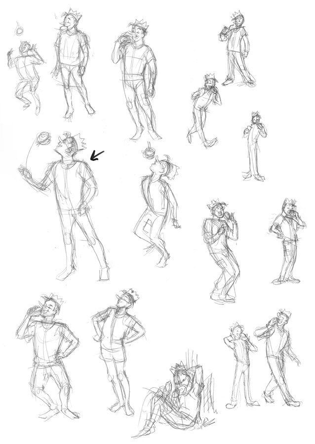
Once I felt comfortable drawing the characters, I did some thumbnail sketches for each character's pose, searching for the best character-appropriate gesture for each. It's worth noting that when I'm doing gesture sketches like this, I'm working small and fast. I'm not worried about proportions or details--that comes later. This is all about finding the pose.

Veronica
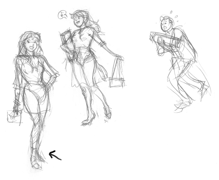
Veronica is the rich girl that pretty much gets what she wants. I decided to give her a hand-on-the-hip pose that emphasized her confidence and stylishness. For her outfit, a cute flirty dress, clutch handbag, and a bit of bling. I briefly entertained the idea of a more illustrative shopping scene for her (with bag carrying Archie in tow), but decided to stick with standalone poses.

Veronica poses
Betty
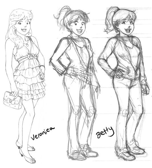
To contrast Veronica, I went with a sportier pose, and jeans and jacket outfit for Betty. I got pretty far in the drawing when I realized the pose was a bit too similar (hand-on-hip again) to Veronica's.

Betty - pose and rough pencils, next to finished Veronica for comparison.
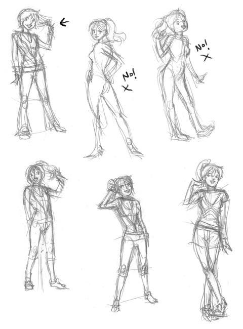
Keeping the keywords "cute" and "sporty" in mind, I started over. Of these, the first two I did (upper middle, upper right) weren't right at all for Betty -- too sexy; too cutesy. After that, I stopped and reconsidered the character. Sweet and sporty. I liked the gesture of Betty twirling a finger around her hair to showcase her ponytail, so I kept that in the rest of the sketches. I ended up going with my third attempt (first sketch on the top left).

More Betty poses
Archie
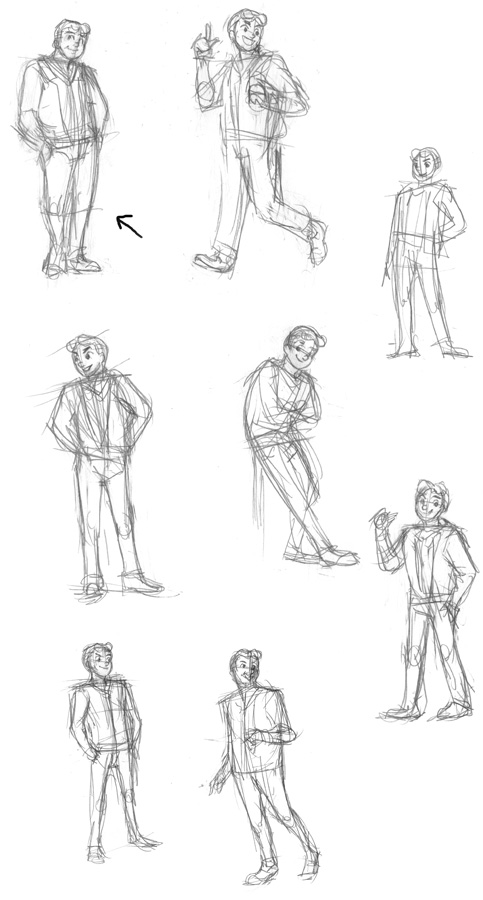
Archie's your average, nice guy character that everyone gets along with. For his pose I decided to show him "just hanging out".

Archie poses
Jughead
Jughead's the goofy comic relief character. To capture his cartoony mannerisms, I tried to push his poses towards the extreme (without going too far). I thought it would be funny to show him tossing an entire burger in his mouth the way you might with a piece of candy.

Jughead poses
Polishing the Art
Once I had my poses selected for each character, I printed out the sketches at a larger size with blue lines so I could do a clean pencil pass over them with their proper details and proportions.
And here's the finished results!

Sunday, November 7, 2010

Under the Influence of Manga

Comics editor Tim Beedle discusses on his blog whether or not it's necessary for manga-influenced Western artists to change their style in order to find work.

I chimed in with my experience as a professional manga-influenced comic artist. My full reply is below, but you should also go read Tim's post and the proceeding comments. The whole discussion is very interesting.

-----

As a creator who was part of the OEL movement, this topic hits close to home. For me, manga had a heavy influence on my artwork during my formative teen years. My manga-influenced art style wasn't something I quickly adopted as a moneymaking scheme to dupe the manga-reading public, as some naysayers of the OEL movement believe, but simply a part of me, a natural expression of the material I grew up reading. An art style that was natural to me, intuitively picked up from years of reading manga, mixed with other influences, and personal touches.

For a while, it looked like the possibilities for manga-influenced artists were on the rise, until the manga market/economy collapsed. Then Tokyopop stopped taking chances on creator-owned properties, other companies followed suit, and the movement more or less died (save for the small handful of licensed properties -- good opportunities, but nowhere near enough to support all of the talented manga-influenced creators out there).

Following the completion of Peach Fuzz in 2007, I went from being a successful creator with a growing career, back down to the ground level, scraping around for jobs, painfully discovering that outside of the Tokyopop bubble, there are very few opportunities for comic artists heavily influenced by manga.

The year or two following Peach Fuzz, I received my fair share of rejections: art agents telling me that while my art is professional and solid, it's unmarketable due to a lack of jobs calling for a "manga" look; publishers and literary agents enjoying a story premise, but turning it down due to, again, the "manga" look. Eventually the message started to sink in: adapt or die.

The last couple of years, I've been working to tone down the manga influences in my artwork, but it's been a painful process. Some good has come from pushing myself in a new direction - I've definitely grown a lot as an artist because of it. For example, I've developed a new approach to comic pages that I'm very happy with (see Last of the Polar Bears). But it's also depressing to look back at Peach Fuzz, and the art style that came very naturally to me, that I've had to sweep under the rug and hide.

The thing that gets me the most, is that even though mainstream publishers are apprehensive about comics with a heavy manga influence, the kids and teens adore it. The amount of times I've had kids come up to me at conventions to tell me that they loved Peach Fuzz, or even that it was the first "manga" they ever read (!!) are too numerous to count. The kids don't have any innate prejudices against the material--all they want is fun, appealing stories to read. Give that to them, and they're happy--who cares whether your artistic influences are eastern, western, or both?

Given enough time, I'm sure more publishers will open themselves to manga-influenced  comics again... In the meantime, should creators have to alter their style to make a living? Sorry to say, but at least for this creator, it was either that or find a new career path.

Monday, September 20, 2010

The Last of the Polar Bears pgs 28-29


I updated www.lastpolarbears.com with pgs 28-29. Stella discovers the joy of leaving pawprints in the snow.

If you're relying on my blog for updates, pgs 26-27 will also be new to you. :)