Tuesday, June 30, 2009

Nature Speed Paints + Boy and Gator 3 WIP

Here is where I currently am on the final Boy + Gator piece. I'm working my way down from top. The treetops and distant background details are done. Tomorrow, I plan on tackling the tree trunks and ground areas.


To brush up on my foliage painting abilities for the illustration, I did a couple of speed paintings, referenced from photos in my personal archive.


This was the view from my window at the last apartment I lived in. Photoshop CS3, 30 minutes.


Photoshop CS3, 50 minutes.

Watch me create the piece on livestream:

Monday, June 29, 2009

Speed Painting - Charly the Shih Tzu


I was thinking about how it's a good idea for artists to practice painting techniques by doing speed paintings from photos or life.

When I'm painting illustrations, I'll sometimes have photos to help with the general feel, but I rarely have direct reference, so shadows and highlights come from my preexisting knowledge. This is certainly limiting my artistic growth, so I'm going to take my own advice and start doing some small practice paintings to improve my speed and technique.

Tonight, I intended to practice foliage but I came across this cute photo I'd taken of Charly, Natalia's adorable Shih Tzu, and decided to paint him instead. :)

Photoshop CS3, 45 minutes.

Watch me create the piece on youtube:

Sunday, June 28, 2009

Boy and His Gator - Bonus


This image is *not* final part of the three-part series "Boy and His Gator". I'm still working on that image (stay tuned!). :)

Rather, I created this one for use on the back side of a new promotional postcard I'll be putting together soon.

Friday, June 26, 2009

Boy and His Gator 2 - Complete

Whoops! Mom found out about boy's secret alligator friend.


This is the second illustration in the three-part series, "Boy and His Gator". The first piece can be viewed here: [link]

Pencil lines + coloring in Photoshop CS3.

In contrast to the first image, where I used cool shadows to give the scene an ambient, calm feeling of two friends sharing a private moment, for this second piece, I used warmer shadow tones. I felt that the red tones helped heighten the intensity and harshness of the scene. I imagine mom storming into the room and turning on the light.

Quick tutorial regarding the denim texture:
The denim texture comes from [link] (Thanks Messa for posting such a useful pack of textures!) After I finished painting the shadows and highlights on the jeans, I made a new layer, shrunk down one of the textures and stitched it together over the length of the jeans. Then I set the layer to soft light and 50% opacity. Finally, I used the dodge tool over the highlighted areas of the jeans to soften the intensity of the texture.

Wednesday, June 17, 2009

Boy and His Gator WIP 3

Final picture in the series!


Tearfully, the boy returns the baby gator where he found it. Wild things belong in the wild. Aww.

The background lineart is rough because I intend to express the background details during the coloring phase. It's been my experience that lines tend to get in the way when it comes to organic scenery.

The Florida Everglades will be my point of reference for this background. As unlikable as this place can be in the summer (soooo hot outside right now), I'm excited for an opportunity to feature my home state in an illustration. :)

Tuesday, June 16, 2009

Boy and His Gator WIP 2

"Not in MY house, young man!"


Picture #2 for Boy and His Gator. Out of necessity to get Mom properly placed in the picture, and still show her displeased hand-on-hip body language, I changed the orientation. I had originally planned to make all the pictures in the series the same size, but a taller format just works better in this case.

Just one more to go and then I move on to coloring.

Monday, June 15, 2009

Boy and His Gator WIP 1


Here's the first drawing in a series of three about a boy and his pet gator. Who hasn't wished they could have an alligator for a pet? :)

Incidentally, I was at a park the other day, and had set down my purse for a moment to feed some seeds to a squirrel. When I picked up my purse, I discovered a small stowaway--no, not an alligator, haha--a baby lizard. When I tried to remove him, he scurried onto my hand and up to my shoulder and tilted his head to give me a seemingly quizzical look. I instantly fell in love with the little guy. Of course, I couldn't keep him, but I walked around with him for a bit before depositing him on a bush. He didn't want to leave. Friendliest baby lizard I've ever met. Good luck in your adventures, little lizard! *sniff*

Anyways, back to the drawing, I'm planning on drawing all three one after the other, and then doing the same with the coloring process. If I'm satisfied with the finished picture, the first one might just become the new picture for my next promotional postcard.


Here's a sneak peek at the roughs for the other two:

Thursday, June 11, 2009

Gator Studies

When planning out a new illustration, I find that the best place to start is to do some studies of the subjects in your picture. My next picture, actually a series of pictures, is about a boy and his pet gator. So I dug through my photo archive and pulled up a bunch of photos I've taken over the years of full size and baby alligators and did some sketching.

Here's the result:
It occurred to me as I was sketching that I'm no stranger to drawing alligators. The design of the Handra character in my Peach Fuzz books is partially inspired by the shape of an alligator's face. Here's what the Handra look like (sorry, this is the only picture of the Handra I have that's easy to access): You see? Little gator snouts!


I also did some general figure sketches just to keep my people drawing skills up. (Hopefully no one's bothered by some mild nudity here). Here's an excerpt from the exercise:

Red Shoes - Complete


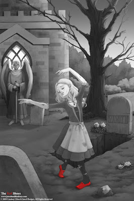
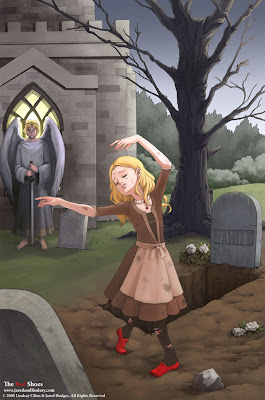
This image was originally done in color, but upon completion, I found that the color detracted from the focus of the piece, her red shoes. So, I put a mask around the shoes and turned the rest grayscale. I think the result is more effective. Though it's a little bit sad to spend all that time coloring just to throw out colors at the end. Eh, c'est la vie!

Speaking of which, here is the original color version:

I tried to make everything gloomy and gray except for the girl, but I'm not too happy with how the colors turned out (another reason I went grayscale). Any opinions on it?

Wednesday, June 3, 2009

Red Shoes WIP 1

Here's my next project for the portfolio: A mock book cover based on the Hans Christian Andersen fairy tale The Red Shoes. From my childhood, I recalled the story being about a girl who puts on a pair of red ballet slippers that force her to dance until she dies from exhaustion. Upon reading the actual story as part of my research for the illustration, however, I was surprised to learn that the original version of the tale is quite different, with some pretty heavy Christian symbolism and morality. In any case, the story has some nice visual elements in it.

Yesterday I did some warm up sketches of dancers and ballerinas. Ballerinas have wonderful poses with strong silhouettes. Very inspiring. I hope to capture some of that in the final piece.

Afterwards, I started working out some thumbnails, figuring out how to arrange the visual elements I wanted to show into a compelling book cover. I settled on the one with a star next to it (lower left corner), and serendipitously stumbled upon a back cover design as well. I think it'll make for a nice companion piece.

Domo!

Info about the no-longer-secret-comic-project. Over the last two months, Jared and I have been hard at work on the Domo manga, a full color graphic novel for publisher Tokyopop involving that lovable brown monster guy with the big mouth!


These are the first sketches I did of Domo-kun and friends to practice drawing them "on model".

Two chapters in the book were done by me and Jared (lineart and lettering = Lindsay, colors = Jared). According to Amazon, the Domo book should be coming out mid-September, so keep an eye out for it!