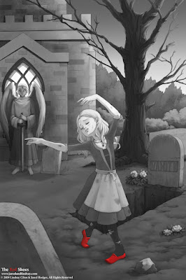
This image was originally done in color, but upon completion, I found that the color detracted from the focus of the piece, her red shoes. So, I put a mask around the shoes and turned the rest grayscale. I think the result is more effective. Though it's a little bit sad to spend all that time coloring just to throw out colors at the end. Eh, c'est la vie!
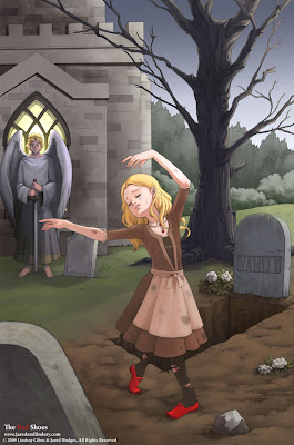
Speaking of which, here is the original color version:
 I tried to make everything gloomy and gray except for the girl, but I'm not too happy with how the colors turned out (another reason I went grayscale). Any opinions on it?

I like it better in grayscale. The impact is huge!
ReplyDelete